A number of the younger generation have opted to forego business cards in exchange for digital forms of communication such as LinkedIn or Twitter. But do you remember the last time you were handed somebody’s business card? Do you remember how professional they seemed, with their name and number clearly printed on heavy-stock paper? How much more credible did they seem than someone simply telling you to connect with them on social media?
Business cards are an essential tool that fulfills multiple purposes: it provides advertising, brand recognition, call-to-action, and of course, give you the contact information right then and there. When done correctly, a business card is a pocket-sized billboard that gives your potential clients the right impression and can hopefully convert them from strangers to customers.
In this blog, we’ll run through everything you need to know about business cards including business card sizes and dimensions, details to include, and even the paper to choose.
Step 0. Create your branding
Before you even begin designing your business card, there is something important you need to settle on first. Whether you’re a successful corporate professional, freelancer, or a one-man homepreneur, you need to finalize to important components for your business card:
- Your logo
- Brand color scheme
Your logo and color scheme will impact your visual choices for your branding. These will help you in designing you business card and will help you in creating your layout and overall brand identity. Once you have these sorted out, you can begin.
Step 1. Choose your shape
The standard business card shape is a rectangle and if you are sticking with that, you can go straight to step 2. Don’t feel restricted by this though. You can be as creative as you want when it comes to the shape and size of your calling card. For instance, if you own a pet store, maybe consider having your business cards done in the shape of a fishbowl. Or if you’re a pianist, maybe one in the shape of a grand piano.
Professional printers have what is called a die-cutter which they can use to create alternative business card shapes. Keep in mind that this will cost you extra, though.

Step 2. Choose your business card size
The next decision you will have to make is deciding on the size of your business card. The standard business card size varies from country to country (you can use the list below as a guide). Even if you choose to go with a different size to stand out, you’ll still need to know the standard so you can choose against it.
- North American Standard: 3.5 × 2 in. (88.9 × 50.8 mm)
- European Standard: 3.346 × 2.165 in. (85 × 55 mm)
- Oceania Standard: 3.54 × 2.165 in. (90 × 55 mm)
- Philippines: 3.5 × 2 in. (88.9 × 50.8 mm)
Regardless of the size you end up choosing, you’ll want to have the following when designing your business card:
- Bleed area: the outermost edges of the business card which will most likely be removed or cut off during production.
- Trim line: the guide lines for cutting the cards.
- Safety line: any element that falls outside this line is subject to cutting mistakes. Don’t put anything important, such as logos or text, outside this line.
While these areas vary depending on your business card size, template, and even your printer, a good guide to follow is:
- Trim line: 0.125 in (3 mm) from the edge.
- Safety line: 0.125 in (3 mm) from the trim line.
- Bleed line: 0.250 in (6 mm) or the total from the edge of the bleed are to the inside of the safety area.
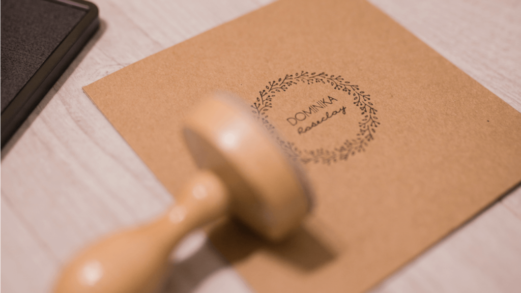
Step 3. Add your logo and other graphic elements
Once you’ve set your guide lines, you can then plot in all your visual elements starting with the logo. The logo should take command of your business card, as it is what should leave a lasting impression on your potential customers.
Don’t forget that you can utilize both sides of your business card! A good way to take advantage of this is to put your logo front and center on one side, while the reverse has all the necessary contact information.
However, it’s also a good idea to have your logo on both sides of your business card. You can still have your logo displayed prominently on one side, then have a smaller version of it printed on the flip side with your contact information.
Experiment with the design and logo placement to see which one you like best.
Once you’ve settled on your logo placement, you can then add other embellishments. Minimalism has been on-trend lately, but if this doesn’t suit your taste or branding, feel free to add other design elements to complement your business.
For instance, if you own a children’s clothing store, you can incorporate children’s toys or stuffed animals throughout your business card to give it a more child-like vibe. For singers, you can add musical notes. Keep in mind that the additional graphics should complement your logo and text. They should show off your brand identity through visuals, including the colors you use.
Step 4. Think about the text
There are no hard and fast rules when it comes to what text to include in your business card. Work-from-home freelancers may not find it useful to include a business address, but lawyers and accountants do. Or graphic designers and video editors may benefit from including their social media handles on their business cards, but teachers may not seem as professional having theirs on their card.
Use your best judgement when it comes to culling which information to include on your business card.
Here is some common text to include on your business card:
- Name: You’re obviously not going to want to give out your business card without having your name on it.
- Company name: Unless you’re a freelancer, having your company written below your name is another given.
- Job title: Traditional business cards often include the person’s job title. This helps the recipient remember who you are, what you do, and even how they met you.
- Phone number: While this may not be your preferred method to being contacted, this may be your potential customer’s go-to way of communicating.
- Email address: This email is the business standard for non-urgent business communications particularly because it allows users to send documents and photos as attachments.
- Website URL: Including your website gives recipients a subtle nudge to check out your site (and doubles as an organic way to drive traffic to your site).
- Social media: As we’ve mentioned earlier, if social media is relevant to your job, then by all means, include it on your business card.
- Address: This is for those who want to draw people to their physical location such as their office or store.
- QR code: QR codes are making a comeback. You can easily link whatever information you want to your business card through you QR code, such as your portfolio, rates, menu, or website.
- Slogan: if you have one, a slogan can help complement and solidify your brand identity. It also gives some brand recall.
Your business card isn’t just about giving out your information; it’s about helping potential customers remember it. Your recipients may already know your name and number but may choose to keep your business card in case they forget it or know someone they can pass it on to.
Step 5. Choose your typography thoughtfully
Once you’ve decided on what text to include on your business card, you can then plan its placement on the card. Graphic design and typography are especially important when working on a business card because you have such a small space available to you and you want to make sure that all of the text you include is legible to all of your readers.
- Size. To ensure your text is legible, you want to use a font size of at least 8 pts. For important elements that you want to highlight, such as your name, you’ll want to use a bigger size though. Don’t feel the need to fill up every available space with text! You’ll want to have some breathing room, or negative space, to avoid making your card look cluttered.
- Font. The font you choose should complement your logo and brand identity. It doesn’t make sense to own a pre-school and have a stiff futuristic font to go with it. The fonts you use will help you tell your story.
At the end of the day, the key thing to note about typography is that you should prioritize legibility over aesthetics. It doesn’t matter how good your font looks if no one can read the text that’s written on your card.

Step 6. Finalize your design.
Once you’ve gotten all your elements settled, you can finalize your design and see how everything works on your business card.
You’ll want to make sure the information and visuals flow correctly on your business card. Are the reader’s eyes directed to the right elements? Which part of the card do you notice first? Which part leaves a lasting impression? A good card should start from the logo, then the name, the secondary information, and end with any secondary images, if you added them.
Remove any distracting text or images. The fewer elements there are, the bigger the chance it sticks with the readers.
If you’re happy with your design, you can then choose which business card paper to use.
We have a separate blog to help you learn how to choose the right kind of paper for printing.
We hope this has helped you in creating your own beautiful and more importantly, memorable business card! Just remember to follow these 7 steps and you’ll surely do just fine.