A font, which serves as the graphical representation of text on a word processor or computer, can be a combination of different qualities, such as typeface, size, or color, among others. It is through these elements that letters and words can help better express what the writer or user is trying to convey. From personal letters to business documents, typefaces or font styles have been around since Gutenberg’s press in the mid-15th century.
Businesses, in particular, have been utilizing fonts to market their products and services through printed and digital materials. There are fonts for business cards, brochures, storefronts, and newsletters; the opportunities for use have grown through the years. Imagine how letterforms have adapted – from the archaic letter block styles reserved for the elite, to the most neutral of fonts like Arial and visually stimulating symbols like Wingdings on our mobile phones. With many design-driven choices, one has to wonder which fonts work best for businesses.
The best of free commercial use fonts include:
- Calibri – Donna Svei, an executive resumé writer, provides five reasons Calibri’s supremacy as the font for career seekers. It’s Microsoft’s default font style, which means it’s easy to read on computer screens. The clarity makes the text readable and easy to understand, which is the most essential.
- Helvetica – Helvetica offers the same simplicity as Calibri does, but its prevalent use for business cards lies in its versatility for headings and body text. Arielle Pardes writes on Wired that Helvetica is ubiquitous for its sans-serif shapes and clean corners.
- Garamond – Garamond offers an antiquated mood to a text, which makes it a classic font for academics and brands with years of experience. Anastasia Belyh of Cleverism talks about resumé writing and Garamond’s professionalism and readability in smaller point sizes.
- Kensington – A free font that provides all the elegance of serif fonts, but with ample spacing so that readability is not compromised, Kensington is among the best fonts for business cards. The effectivity of Kensington, however, requires a sans-serif style that fits well as the body text.
- Futura – Another free typeface that has been around for a long time, Futura offers business cards a popular sans-serif style that works as headings, captions, and body text. Influenced by Bauhaus architecture and geometry, Futura is among the more expressive fonts that can bring out the character of a brand or business.
These font styles can provide an additional layer of meaning to the writer’s intent while also emphasizing what they are about. Business cards serve to do the same – to help the an individual, brand, or business to express themselves and deliver immediate impact. Apart from the above-mentioned, there are many free fonts for business cards that can help add to value to any brand or business.
Are Business Cards Still Used Today?
Business cards, or sometimes referred to as calling cards, are still relevant in 2021. While the actual need for a business card may seem whimsical, chances are, having one at the right time can turn an unexpected opportunity into something more memorable. In these quickly-changing, technologically-driven times, the uses for a business card have changed.
Beginning in 17th century Europe, business cards, which were then larger in size and more ornately decorated, served to announce the arrival of elites and aristocrats. Later on, it eventually became of specific use to leave a card upon visiting someone’s household. Through the years, the uses and purposes of these business cards would eventually grow more informal, but still often serving functions as part of social etiquette. However, it was during the Industrial Revolution and with the bursting growth in trade and commerce, that businessmen began carrying calling cards. Exchanging contact information became a significant driver of many businesses.
Today, with the many advancements that technology has allowed, businesses are not as hard-pressed to disseminate awareness and information through calling cards. The prevalence of digital tools can provide the same purpose, if not at an even grander scale. This doesn’t mean that calling cards are no longer relevant – its use has yet again changed directions.
Does the Font Matter When Making a Business Card?
Depending on one’s purpose for producing a business card, there are many different ways on how to create an effective business card. Choosing an appropriate business card font is at the forefront of the decision-making process. The design, which also includes the color, shape, and card quality plays an important role in delivering on this purpose as well.
Listed below are key considerations when choosing fonts:
- Given the myriad of fonts, one has to consider how to present the goods, which is the goal of every effective business card. The most common information found in business cards include:
- The brand name or the company name
- Your name
- A tagline
- Contact information such as phone/mobile number and email or website
- Flavor text on the back, such as the company history, a slogan, or authentication
Always consider the readability of a font, so be cautious about the style and size, as it should still work with the design. Professional fonts for business cards include the standard typefaces like Calibri or Garamond.
- When choosing a font for a calling card, it is necessary that a brand or business selects a font that represents their audience, and it should be one that resonates with their audience or target market. An architectural firm or engineering company, for instance, would likely benefit from using sans-serif fonts, such as Futura, to depict the firm and sturdy pillars of a structure. A wedding photographer or floral boutique, on the one hand, will be more keen on using a serif font, such as Kensington, to suggest the eloquence and artistry in their brand.
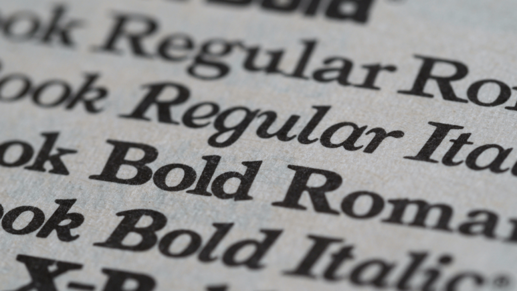
- As a rule of thumb, it is best to use two to three styles for a calling card font, but sticking to one works just as well. A way to be creative with a single font style is using it in different weights. Helvetica, for example, offers a range of weights. Starting with its thinnest attribute, Helvetica Ultra Light, there also exists Helvetica Thin, Light, Roman, Medium, Bold, Heavy, and Black. Knowing how to use the according weight for headings and body text for a single font style can provide a minimalist and straightforward look.
- The best font for business cards are often eye-catching and memorable. By “eye-catching,” it doesn’t mean that a calling card has to be exploding with colors, but it has to demand some amount of recall through its visual appeal. After all, who would want to keep a lousy-looking calling card? Unless it’s for a collection of the most terrible calling cards, no one would, unless the card contains really important contact information. Creative calling cards maximize the potential that font styles can offer, and the best ones can have standard-looking fonts, but still stand out from the rest.
It may seem like a simple task, but creating an effective calling card can be quite a challenge. Through the concept and design, it’s attempting to condense a business and what the organization is all about into a piece of hard paper that can fit into a wallet. Try coming up with a shortlist after mixing and matching different font styles into the design, and trimming it down to a few samples, which can then be surveyed as they’re handed out to a small sample.
On Printing Business Cards
As mentioned earlier, a calling card can only be as effective as a marketing tool if the design is good. But what good can “good design” bring if it doesn’t translate well upon printing? This is why it is also useful to visualize the actual output while in the planning phase. Knowing what the business card should look like in your hand even before having it printed can set the expectations that deliver.
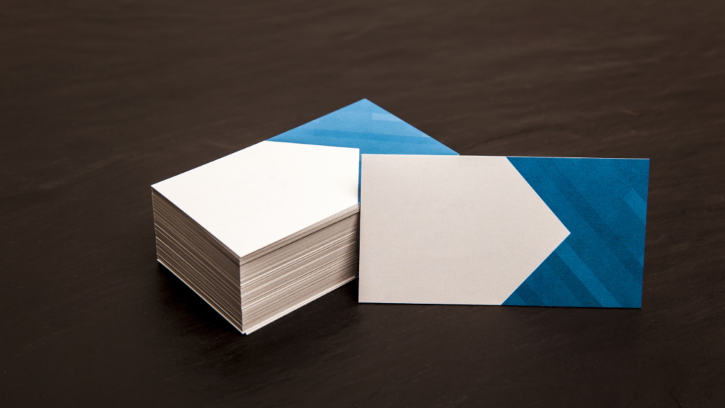
Choosing Paper Stock and Size for Business Card Printing
There are various materials used for business card printing. Creatives have come up with the craziest ideas – sometimes using non-standard materials and taking unconventional forms –and turned them into actual business cards. For the practical lot, the usual business card will have to do, won’t it? Next to ink, choosing the right material can help an effective business card make a lasting impact. Given the different types of paper stock, how does one choose?
Selecting the paper stock for your business card can be the most important part in the production process. It is crucial for the printer to get it right, as a business card is designed to be printed on specific materials, which allows the design to look a certain way. That being said, here are the usual printing qualities, so you know how to choose paper for printing:
- Paper Weight
- Paper Finish
- Paper Material
- Purpose of Printed Material
Printers will often have a package of choices for business card printing. Including the paper stock, professional business card printing service providers will usually offer templated sizes, colors, and shapes for a fixed number of pieces. Fortunately, there are printing shops that offer customized printing services as well.
Here are the usual paper qualities to consider for business card paper:
- Card paper weight – 14 to 16pt stock is commonly used, but 18 to 32pt stock is recommended.
- Finish – Often a choice between matte, satin, and glossy.
- Uncoated – Raw and untextured, non-reflective paper, prone to damage.
- Coated – Provides shine, weight, and ink absorbency.
And apart from deciding on the card’s shape, here are the specifics for business card size:
- North American Standard: 3.5 x 2 in (88.9 x 50.88 mm)
- European Standard: 3.346 x 2.165 in (85 x 55 mm)
- Oceania Standard: 3.54 x 2.165 in (90 x 55 mm)
- Philippine Standard: 3.5 x 2 in (88.9 x 50.88 mm)
The paper stock serves to bring the business card’s design to life, and depending on one’s branding, the paper weight and finish can work together to complement the design. With the right design, selecting a heavier weight with a matte finish can work perfectly as a business card. It is important to acknowledge that the thicker the paper, the more costly it is likely to be as well.
Size considerations, meanwhile, are structured around the standard sizes of a region’s wallets, where most calling cards are placed. This doesn’t mean that a card has to conform to these sizes, as custom-sized cards, often in other shapes, are also available. With these opportunities for customization, it still has to be understood that there are limitations to the printing process. Printers have to consider the bleed area, trim line, and safety line, so one has to work around these in the design phase when deciding on the size of the business card.
Do Business Cards Have a Place in the Future?
Given the ways that there are industries that still require social interaction, there will still be a need for business cards. Throughout history, its purpose has been redefined, and through many forms, it has evolved as well. Humans are always going to be in search of identity. A business card or calling card is one of the ways that provide people with emotions that can empower self-identity. If the business card has any place in the future, it is more likely that it takes on more complex, electronic forms.